Dashboards
Use Cashflow overview, breakdown charts, and report tables to review cash flow.
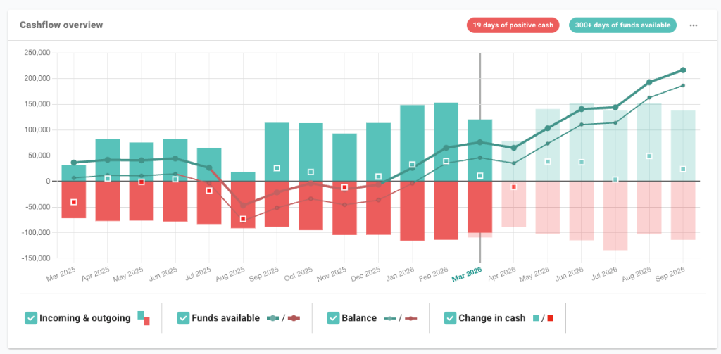
Cashflow overview
The Dashboard opens with a Cashflow overview card. It combines incoming and outgoing movement, balance, and change in cash for the selected dashboard period.
- Monthly view: changes the chart grouping used in the overview.
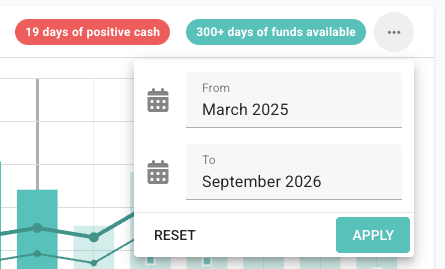
- Date range: sets the from and to months used by the dashboard chart.
- Positive cash badge: shows the number of days with positive cash in the dashboard period.
- Series controls: show or hide Incoming & outgoing, Balance, and Change in cash.
Runway metrics
When credit limits are enabled, the Dashboard shows Days of funds available as well as cash-only runway measures. This separates cash in the bank from total available funding.
- Days of funds available: the number of days before available funds reach zero. This includes bank balances and enabled credit limits.
- Days of cash available: the number of days before cash in the bank reaches zero. This excludes credit limits.
- Runway date: opens the period where the cash flow forecast reaches zero, so you can review the transactions and assumptions behind that point.
Date range and chart detail
Use the date range button in the Cashflow overview card to set the months shown in the chart. The date picker has From and To fields, plus Reset and Apply actions.
Actuals and forecasts in the chart
The overview chart separates recorded transactions from forecast amounts:
- Solid bars and points: transactions that have been recorded.
- Lighter bars and outlined markers: forecast amounts, unpaid invoices, repeating transactions, and future assumptions.
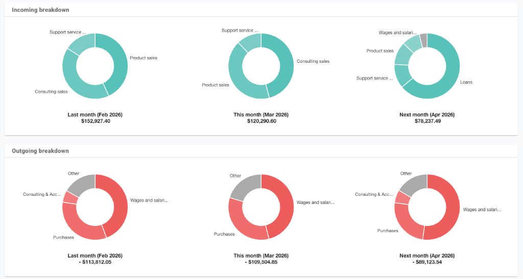
Incoming and outgoing breakdowns
The incoming and outgoing breakdown sections use donut charts to show the largest categories for last month, this month, and next month.
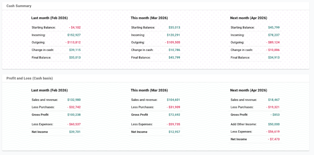
Dashboard report tables
Further down the Dashboard, report tables summarise the selected dashboard months:
- Cash Summary: starting balance, incoming, outgoing, change in cash, and final balance.
- Profit and Loss (Cash basis): sales, purchases, gross profit, expenses, and net income.
- Statement of Cashflow: operations, investing, financing, and net cash change.
- Balance Sheet: bank, assets, liabilities, and equity.
- Top 5 Customers and Top 5 Suppliers: the largest customer and supplier balances.
Customise and print the Dashboard
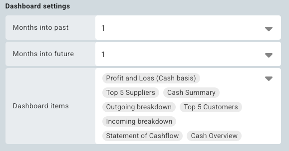
Open the Dashboard tab settings to control the dashboard setup. In the Dashboard settings section, choose how many months to show in the past and future, and select the Dashboard items that appear on the tab.
Printing: Use the Print button in the board header to create a dashboard report for a meeting, client, or team discussion.
Dashboard printing waits for the main dashboard report sections to be ready before opening the browser print window. If a dashboard report looks incomplete, wait for the Dashboard to finish loading and print again.